We made mistakes
In 2007, my DJ brother Gabriel asked me to build him a website. I didn’t know at the time, but it would turn out to be the best thing I ever did.
It took ages to build. I had to learn HTML, CSS and Expression Engine. Five years later Gabriel’s a full time DJ and I’m a user experience designer.
But the best thing about building your own site is the mistakes. Our biggest ones taught me unforgettable lessons about information architecture.
Names are not just about clarity
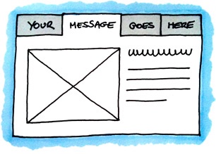
Global navigation is a great way to reinforce messages
Our first mistake was naming. He plays music that people LOVE to dance to. Not shoe gazing indie – raucous, irreverent Jamaican dancehall crossed with UK club music. What do you call the section about their shows?
Don’t call it Events (like we did). It’s clear, but it’s dull.
Events doesn’t sound like fun party music. Events doesn’t even sound like music. Events sounds like corporate functions in conference centres with delegates drinking terrible coffee and talking about ‘getting visibility’.
What should it be called? Parties. Raves. Jams. Gigs. Dances. Shows. Anything that communicates some excitement alongside the clarity. Your global navigation is on every page so what you choose to include, and the words you use, are a huge opportunity to tell your story. Use them wisely.
Not all content is created equal

Put your most valuable content on the homepage
Our second mistake was a classic. We structured the site to match our mental model by splitting the Music section into original productions, mash-ups, remixes, refixes, mixes, live shows and radio shows. Clear. Logical. Wrong.
Why? People only care about two categories. Good music. Bad music.
Only publish the good stuff. Don’t hide it in subsections. Put the very best on your homepage so people can get at it within two seconds of arriving.
Truthfully, very few organisations have enough high quality content to justify complicated hierarchies. Much better to publish a stellar subset and leave your users wanting more. Or you risk overwhelming them with choice.
Humans beat computers (sometimes)

Some content is best left to humans to edit by hand
Our third mistake – and this one is an all time favourite pastime of mine – was getting carried away with the content model. We designed our events to have titles, venues, locations, prices, addresses, concessions, web links, booking offices, artists and plenty more. We were exceptionally proud of our design.
This pride was misplaced.
Within two minutes of entering the first event we realised we didn’t have all the right information. We made some fields optional, which broke the visual design by leaving gaps where content was previously. We hacked the code with if/else statements for millions of data combinations. And it still never worked properly.
In the end, three years later, the solution was stupidly simple.
For rapidly changing content where you can’t predict the shape of the data, just have a page that a human can edit by hand. We’re good at that.
Huge mistakes can bring huge benefits
We saved the biggest mistake until last – last year Google killed the site for being infected with malware. We hadn’t updated Expression Engine for four years and deserved what we got, so we started over. (Losing a thousand pages overnight was easier and far more effective than a content audit!).
But this isn’t about Gabriel’s site anyway. It’s not even about information architecture. It’s really about how I learned to learn from my own mistakes.
Owning up to my bad decisions was horrible at first. It made me feel like I had given bad advice and often felt easier to argue back. The turning point was a conversation where Gabriel pointed out how much it took to maintain the site and I was practically shouting in denial. He, the client, was right.
Over time, I got better at admitting mistakes and started to relish finding flaws in my own thinking. Welcoming criticism is the hardest thing I’ve ever learned to do – and I’m still working on it – but nothing has improved my work quicker.
Let me know what you think on @myddelton. Thanks to Gabriel for putting up with me, @MagsHanley for encouraging us to share IA war stories and @Mike_FTW and @slowtext for their great podcast, Let’s Make Mistakes.


